Brand Identity · Logo Design · Web Design
A self-development platform blending AI, text-to-speech, and psychoacoustics into personalized audio experiences. The product was already built. What they needed was a brand identity to help establish who they were.
IntentOne came to me with a working product and no brand: a platform already built on AI, text-to-speech, and psychoacoustics, designed to give people a genuinely new kind of self-development experience, but still nameless in every visual sense. There was a questionnaire, an engine, a real idea people could use. There just wasn't a logo, a color palette, or anything that said who they were.
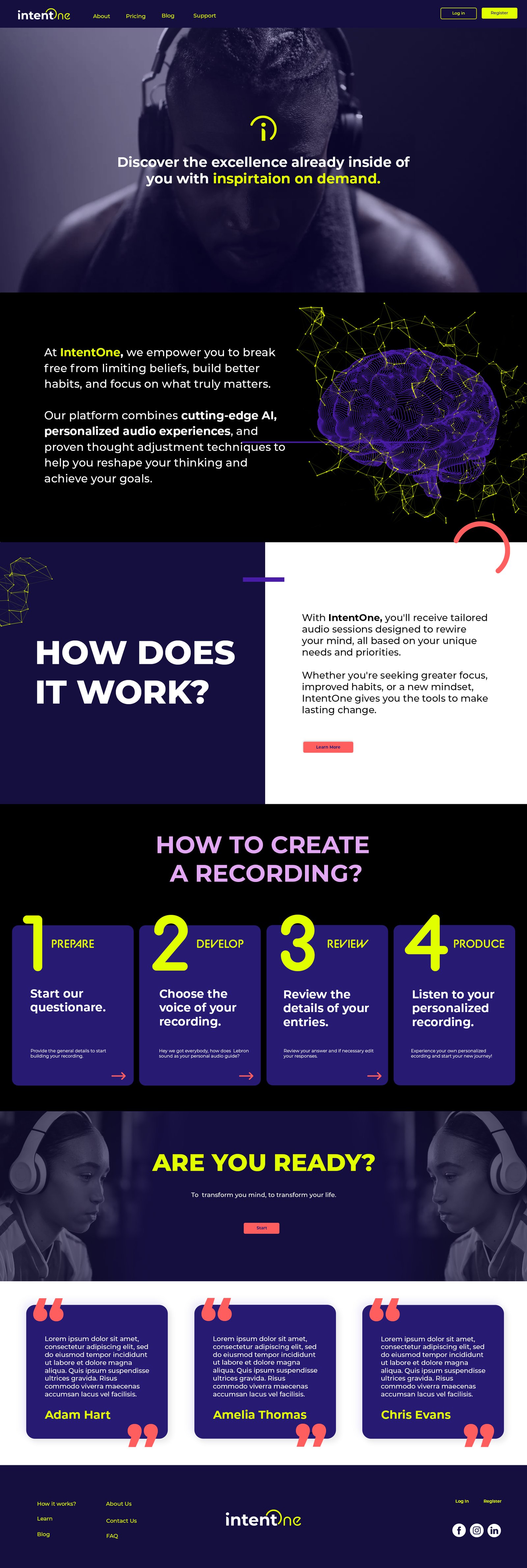
My job was to build that identity: the logo, the visual system, the brand guideline the team could put on top of what they'd already made. Once that groundwork was in place, the engagement grew into an ongoing retainer, and I moved into shaping the look and feel of the website itself, the place where the product would finally live.

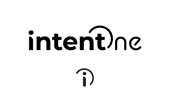
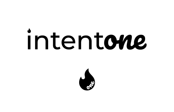
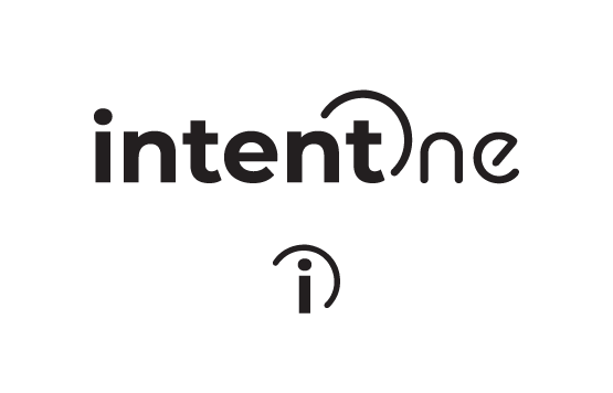
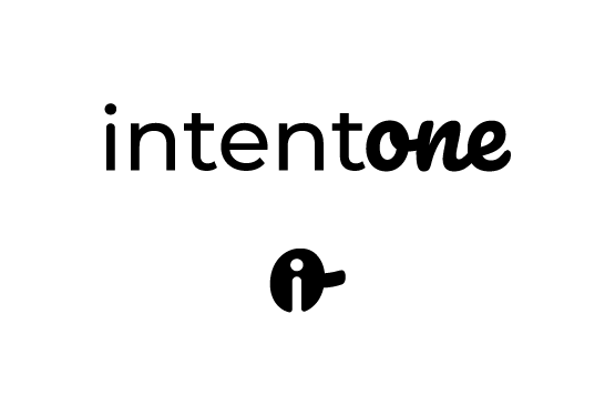
Round one explored two very different personalities: a clean geometric wordmark with a halo built into the second "o," and a looser, hand-drawn version paired with a flame mark. The halo read as an ear, a target, and a loop all at once, and it became the clear direction from there.
Main difference from 1.A is the "i"
Round 1 · Four directions presented for client feedback
With a direction chosen, the work moved from concept to system. The halo sharpened into a clean arc where "intent" and "One" fuse into a single icon, with the accent color doing double duty as the dot on the "i" and the ring around the "o." IntentOne needed a palette that felt energetic and technological without narrowing who it spoke to, so acid green carries the identity and coral steps in where green doesn't fit.
Primary Logo
White and green logo over purple background.
Primary Icon
Green icon over purple background.
Secondary Logo
White and coral logo over purple background.
Secondary Icon
Coral icon over purple background.
On Light Backgrounds
If the primary logo has to sit on a light background, these are the approved alternates.
Solid Color Options
Black
Purple
Multi Color Options
Purple & Coral
Purple & Light Purple
A near-black purple carries the brand's weight, with acid green standing in for energy and clarity of thought. Coral, light purple, and a mid-tone purple round out a secondary palette for illustration and content categories.
Montserrat
Nav, labels, UI structure
Aa
ABCDEFGHIJKLMNOPQRSTUVWXYZ
abcdefghijklmnopqrstuvwxyz
0123456789
Baloo 2
Section titles, "Our Science" series
Aa
ABCDEFGHIJKLMNOPQRSTUVWXYZ
abcdefghijklmnopqrstuvwxyz
0123456789
Khula
Paragraph & long-form copy
Aa
ABCDEFGHIJKLMNOPQRSTUVWXYZ
abcdefghijklmnopqrstuvwxyz
0123456789
Once the identity was locked, the retainer work began: taking the system from a logo file into a full marketing site. I designed several key pages to showcase how the brand could look in practice, bringing the logo, color, and type system to life across a real product experience.
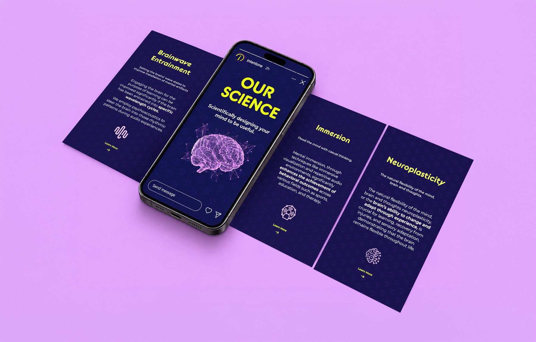
The same brand system carries into social: a repeating "i" watermark, the deep-purple field, and green reserved for facts and calls to action, keeping every post instantly recognizable as IntentOne no matter the topic.