Freelance · Brand Identity · Web Design
Mia and Hailee Elmore were building their private speech therapy practice from the ground up. They needed a brand that felt warm and skilled, and anything but sterile. They had no set direction, just a feeling: professional, but not cold. Polished, but not corporate.
I led the creative direction from research to final delivery, designing the brand identity and website.
The Challenge
Speech therapy practices tend to look the same: blues, greens, clinical fonts, stock photo smiles. The Elmores wanted to stand out to parents searching for a therapist, while still signaling trust and expertise.
The brief I gave myself: make it feel like a professional you would actually want to call.
Round 1
Round 2
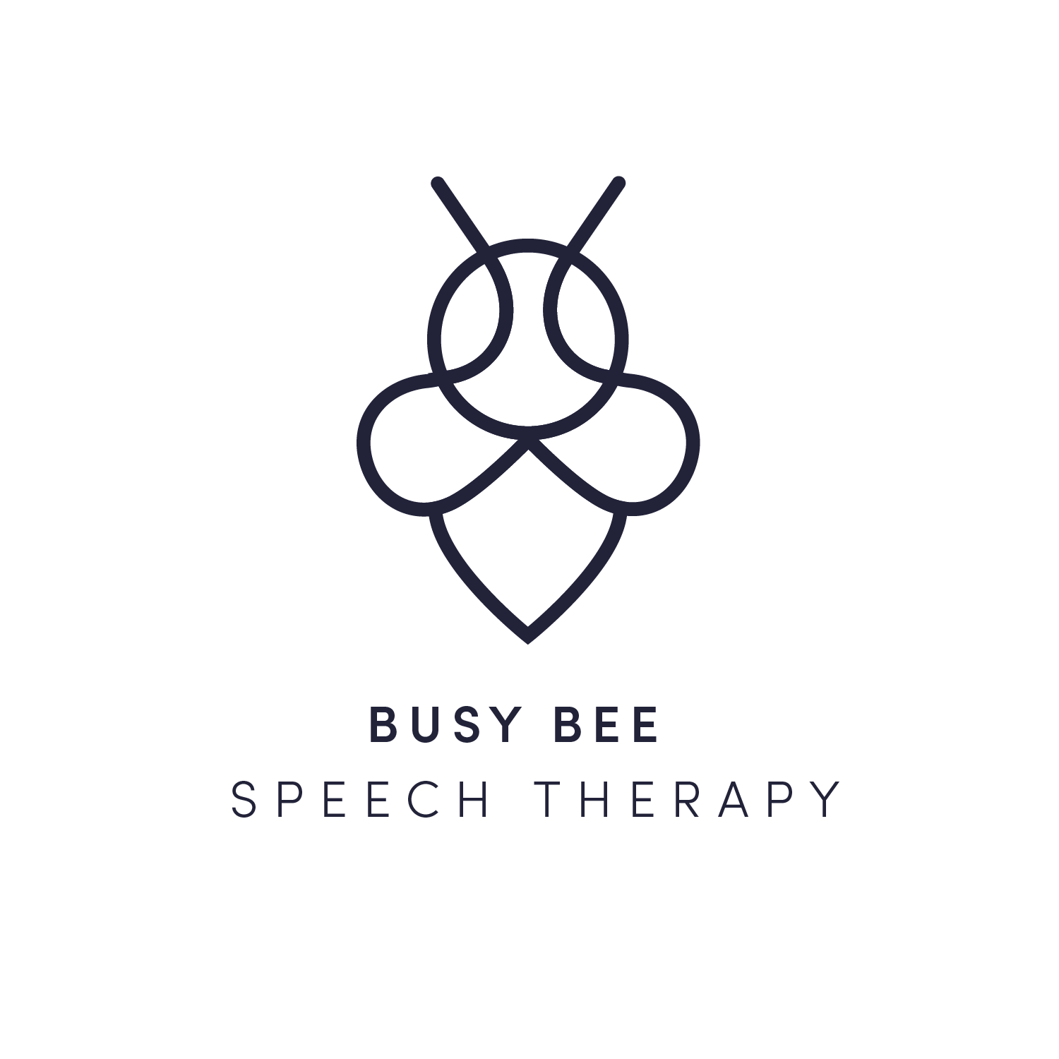
Finding the right bee. Round one paired Sophia Pro with a clean, modern bee mark. Mia and Hailee liked the direction but wanted the bee to feel more alive and less geometric.
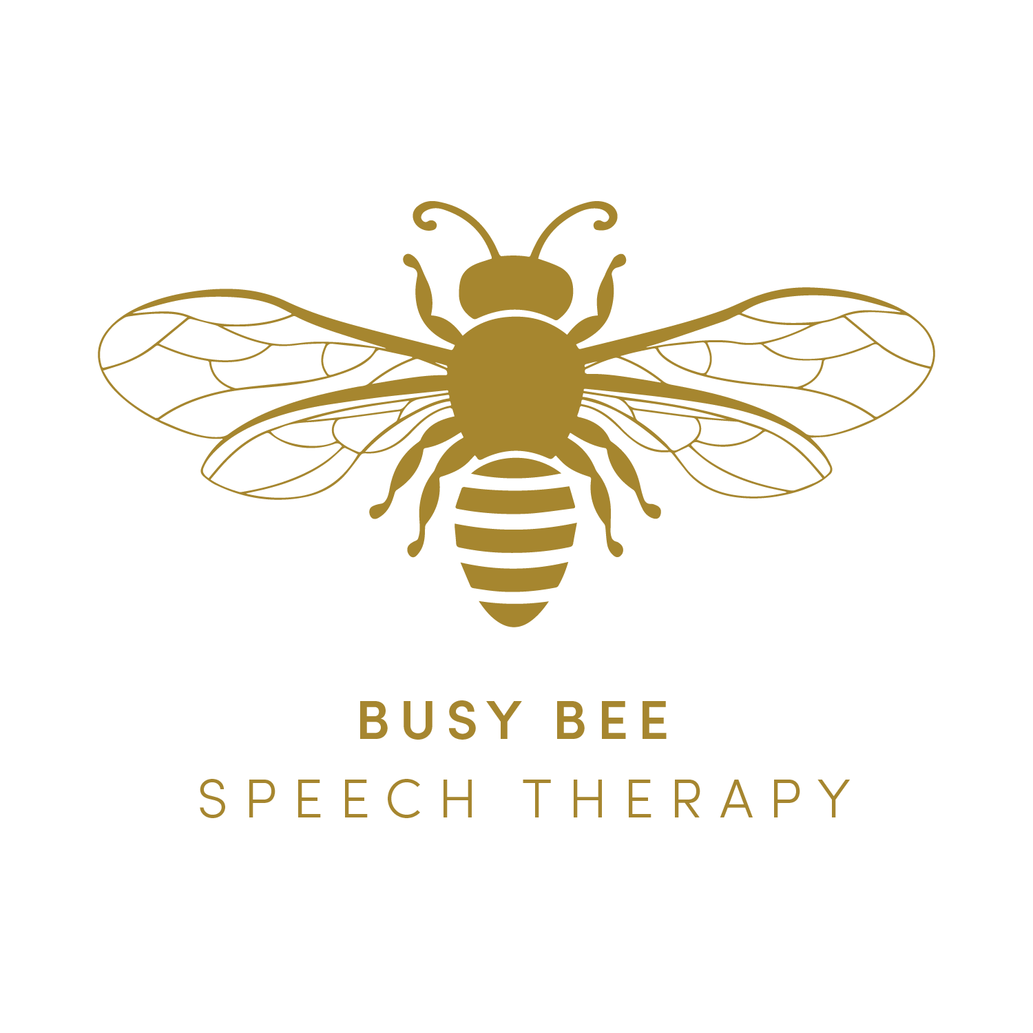
In round two I gave the bee a fuller body and more detail. They loved it immediately.
The palette anchors the brand: warm golds and muted rose for personality and approachability, deeper slates for professionalism and calm. This was not a medical office. It was a practice built by two people who love what they do, and every color choice had to show it.
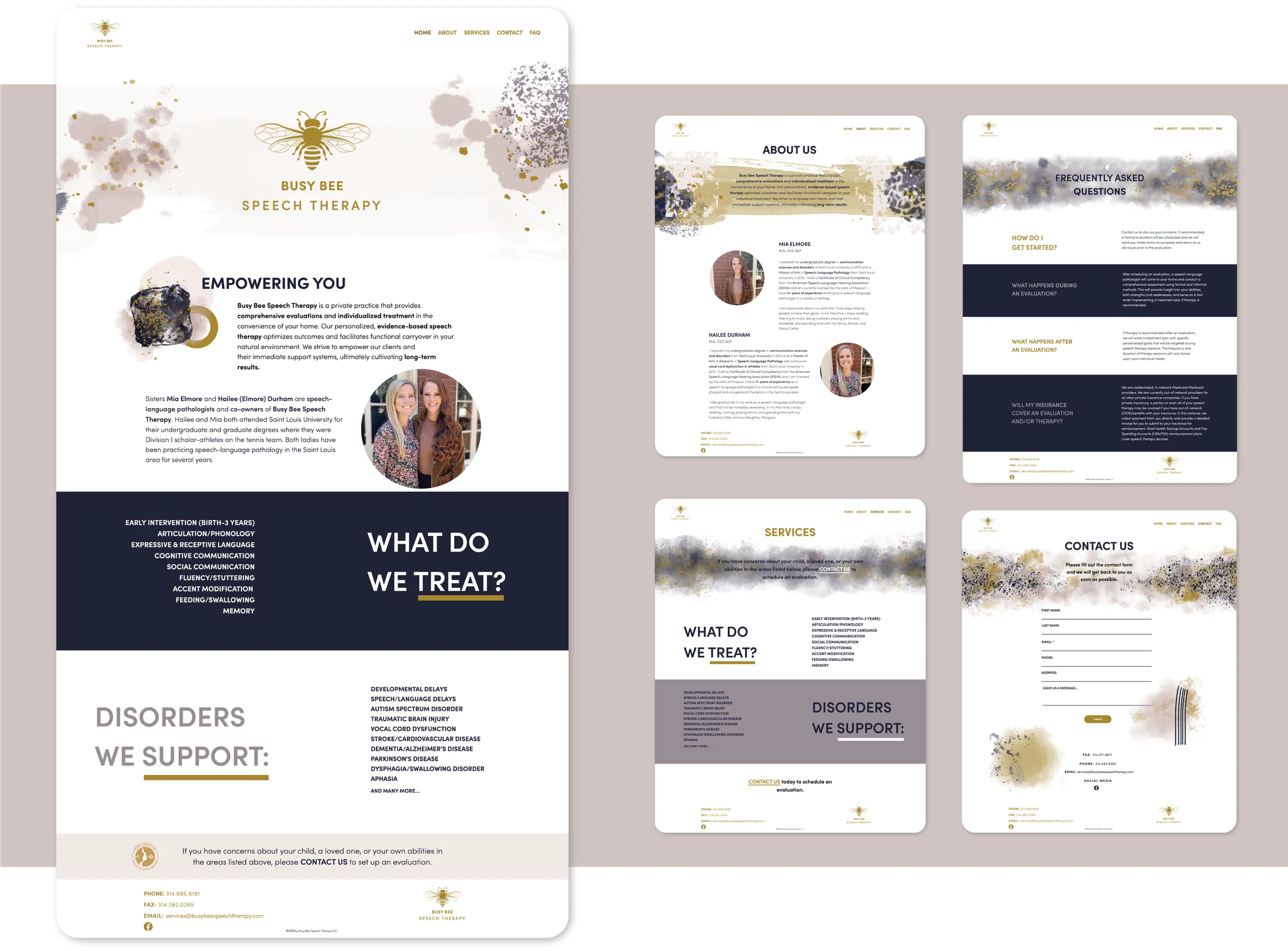
A brand only works if it travels. The website has one job: make it easy for a parent to find them, trust them, and reach out, with clean navigation and a clear hierarchy.
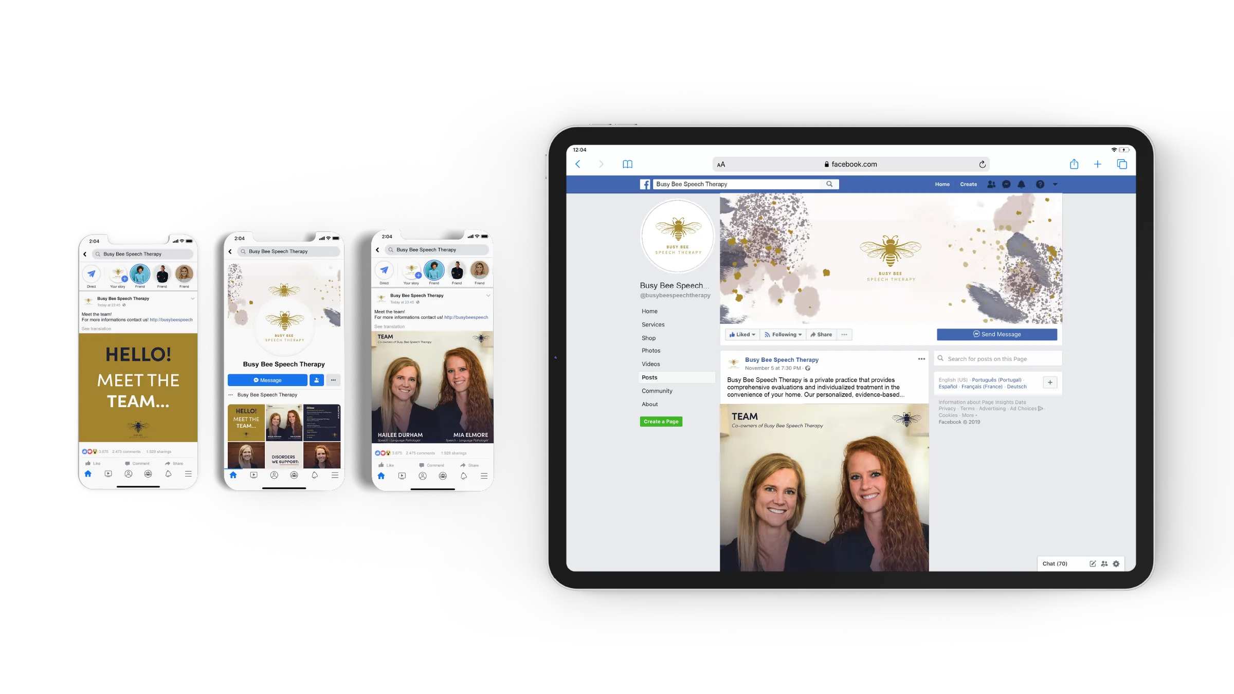
The same system extends to social media, from profile to grid to graphics. Gold, blush, and slate carry from the logo to the screen, so whether someone finds Busy Bee through Google or Instagram, the brand feels like one thing.
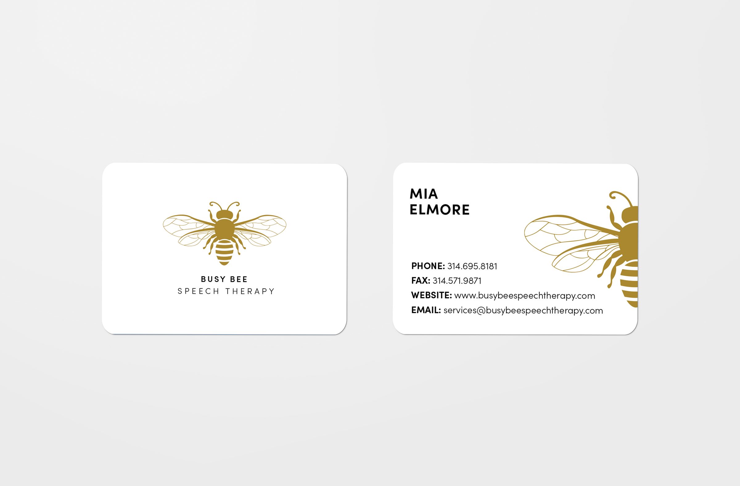
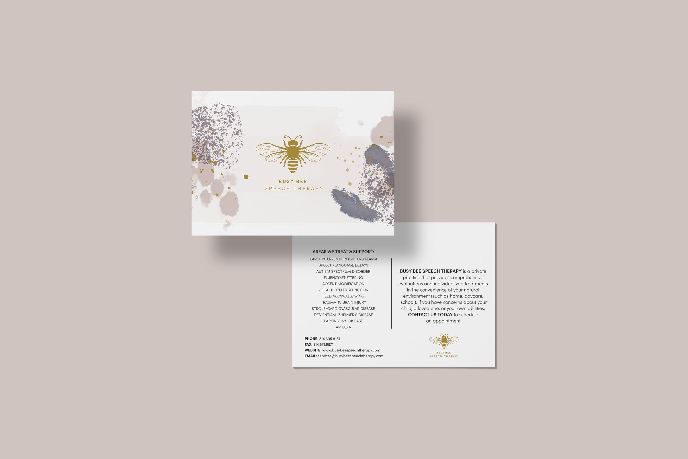
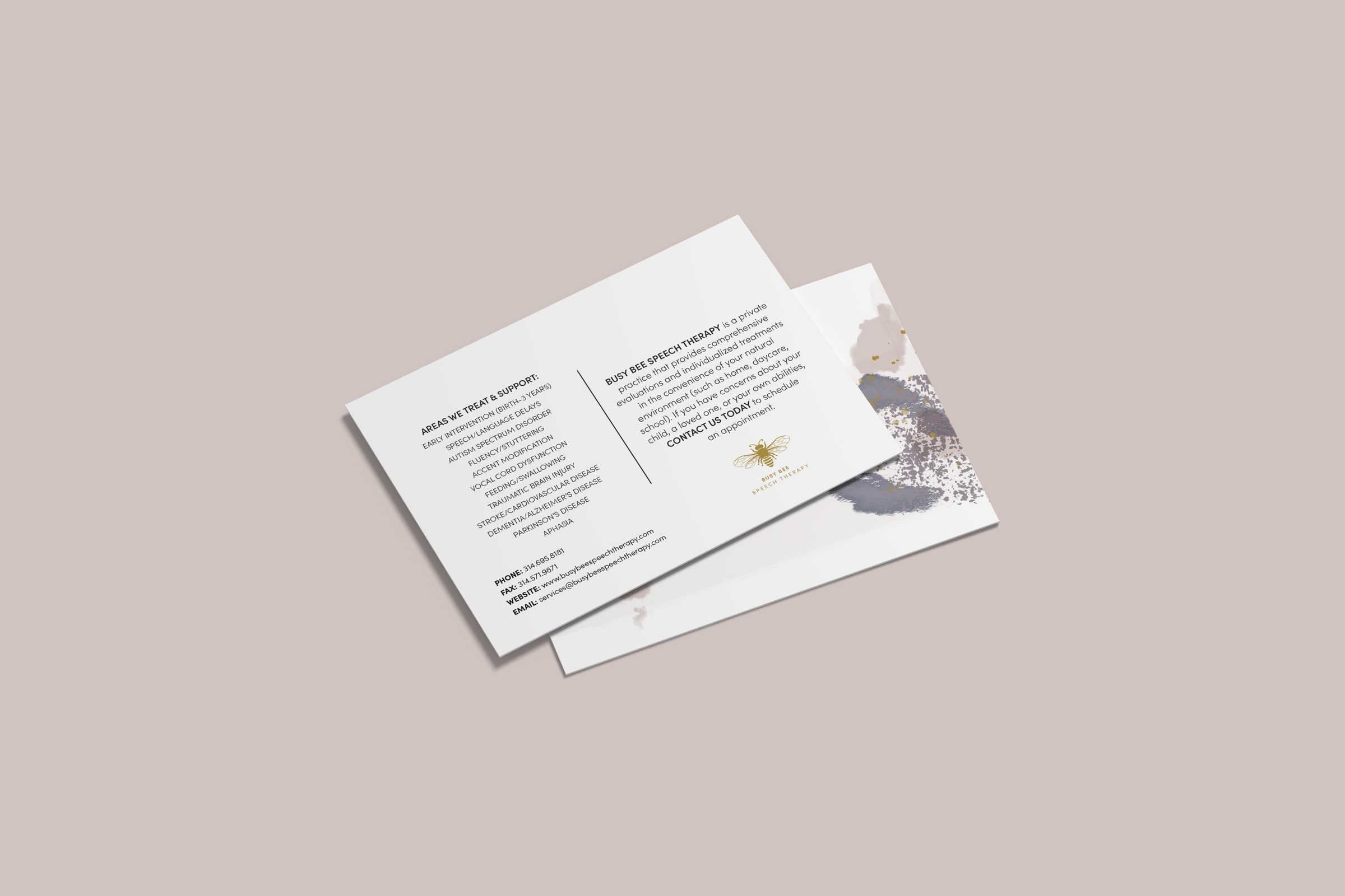
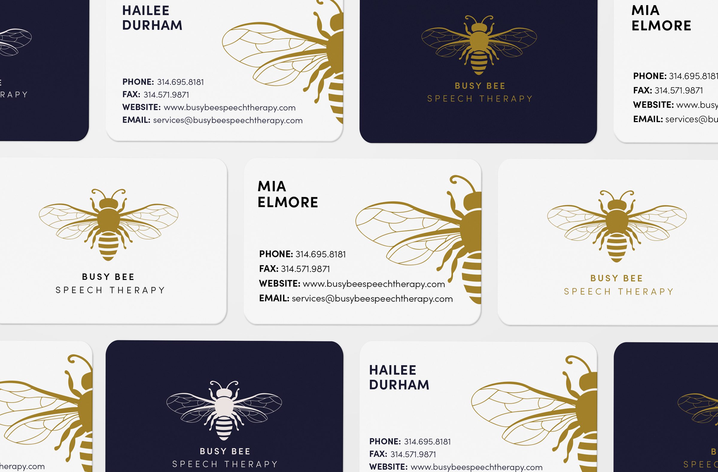
The brand needed to hold up in print as well as on screen. The business cards and postcards keep the logo's restraint: a clean layout, the bee mark used with confidence, and a soft, warm palette.
Every physical touchpoint was a chance to remind someone that this was a practice worth trusting.